It provides a learning service where teachers and
students together identify six types of cyberbullying
within a school-themed metaverse.
They then enter stages based on eight different
competencies to complete various missions.
Cyverse
A digital content platform designed to prevent cyberbullying.
Client
Ministry of Education
and KERIS
Team
1 Product Manager
2 Dev Team, 2 Product Designers
Timeline
Dec 2023 -
Feb 2024
My Role
Product,
UX/UI, Research
Client
Ministry of Education
and KERIS
Timeline
Dec 2023 -
Feb 2024
My Role
1 Product Manager,
2 Dev Team,
2 Product Designers
My Role
Product,
UX/UI, Research
Cyverse
A digital content platform
designed to prevent cyberbullying.
Client
Ministry of Education
and KERIS
Team
1 Product Manager
2 Dev Team, 2 Product Designers
Timeline
Dec 2023 -
Feb 2024
My Role
Product,
UX/UI, Research
Client
Ministry of Education
and KERIS
Timeline
Dec 2023 -
Feb 2024
My Role
1 Product Manager,
2 Dev Team,
2 Product Designers
My Role
Product,
UX/UI, Research
Cyverse
A digital content platform designed to prevent cyberbullying.
Client
Ministry of Education
and KERIS
Team
1 Product Manager
2 Dev Team, 2 Product Designers
Timeline
Dec 2023 -
Feb 2024
My Role
Product,
UX/UI, Research
Client
Ministry of Education
and KERIS
Timeline
Dec 2023 -
Feb 2024
My Role
1 Product Manager,
2 Dev Team,
2 Product Designers
My Role
Product,
UX/UI, Research
It provides a learning service where teachers and
students together identify six types of cyberbullying
within a school-themed metaverse.
They then enter stages based on eight different
competencies to complete various missions.
It provides a learning service where teachers and students together
identify six types of cyberbullying within
a school-themed metaverse.
They then enter stages based on eight different competencies to complete
various missions.
First, if teachers enter their basic information and students enter
their basic information along with the teacher’s ID, accounts will be created.
First, if teachers enter their basic information and students enter
their basic information along with the teacher’s ID, accounts will be created.
First, if teachers enter their basic information
and students enter their basic information along with
the teacher’s ID, accounts will be created.
When a teacher creates an account, a class is automatically generated.
Then, they can start using the VR content called the metaverse.
When a teacher creates an account,
a class is automatically generated.
Then, they can start using
the VR content called the metaverse.
When a teacher creates an account, a class is
automatically generated. Then, they can start using
the VR content called the metaverse.
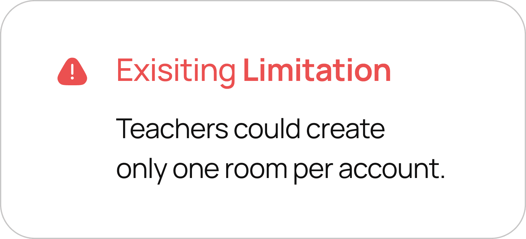
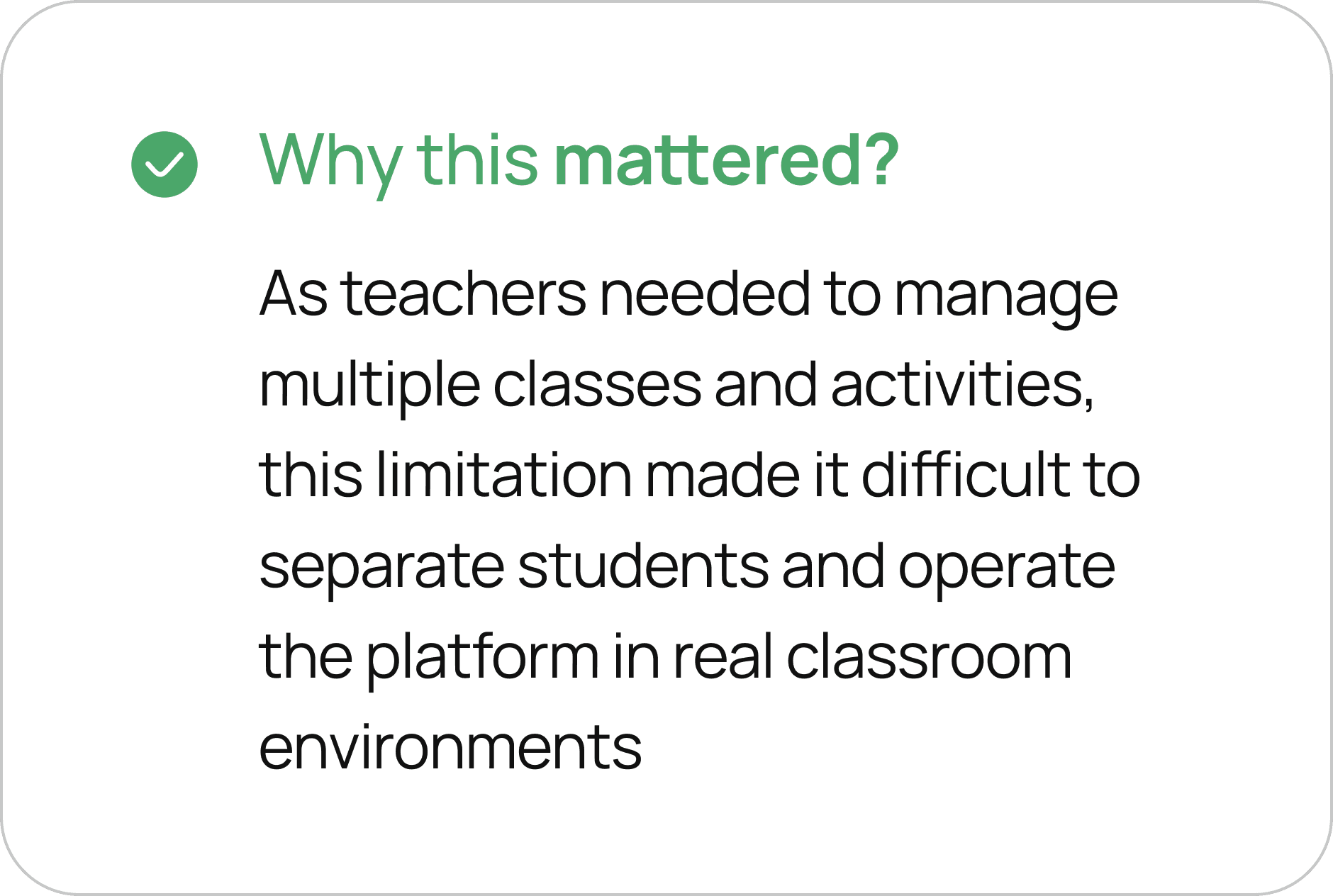
During the kickoff meeting, the clients mentioned that
teachers had to create multiple accounts to manage
multiple classes when they tested with a prior version of it.
As a result, we decided to improve this feature to make it more efficient.
During the kickoff meeting,
the clients mentioned that teachers
had to create multiple accounts
to manage multiple classes when they tested with a prior version of it.
As a result, we decided to improve this feature to make it more efficient
We conducted UX research, including desk research, competitive analysis,
and user interviews to understand users' needs and identify problem areas.
We conducted UX research, including
desk research, competitive analysis,
and user interviews to understand
users' needs and identify problem areas.
We conducted UX research, including desk research,
competitive analysis, and user interviews to understand
users' needs and identify problem areas.
We gained many insights, especially through the personal experiences of teachers
during the user interviews. We discovered that they were using specific
educational websites, so we conducted a more detailed competitive analysis,
considering that there might be familiar usage patterns among users.
We gained many insights, especially through the personal experiences of teachers during the user interviews.
We discovered that they were using specific educational websites,
so we conducted a more detailed competitive analysis, considering
that there might be familiar usage
patterns among users.
Especially, we gained many insights through
the personal experience of teachers during the user interviews.
We discovered that they were using specific educational websites,
so we conducted a more detailed competitive analysis, keeping
in mind that there might be some familiar usage patterns among users
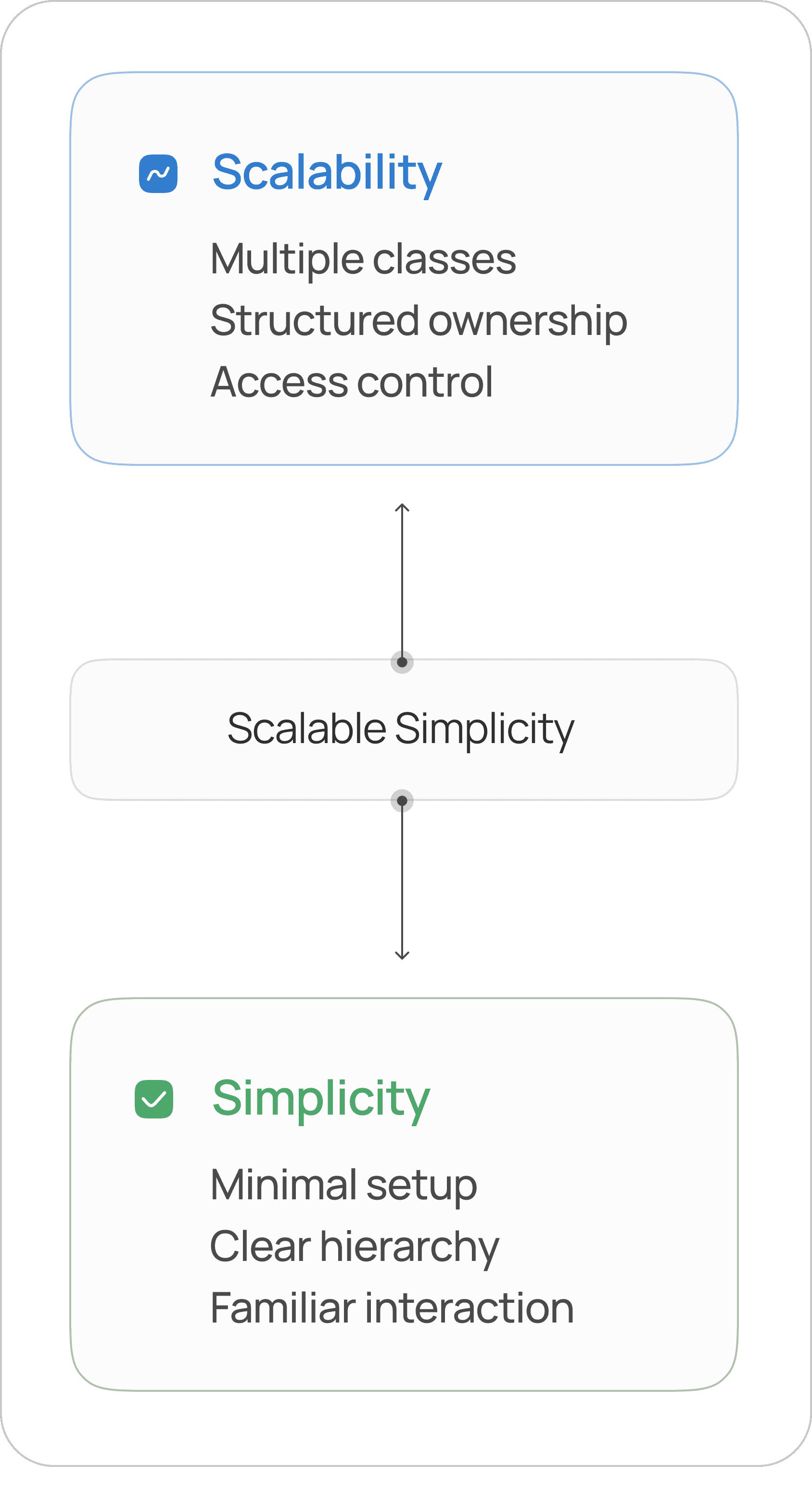
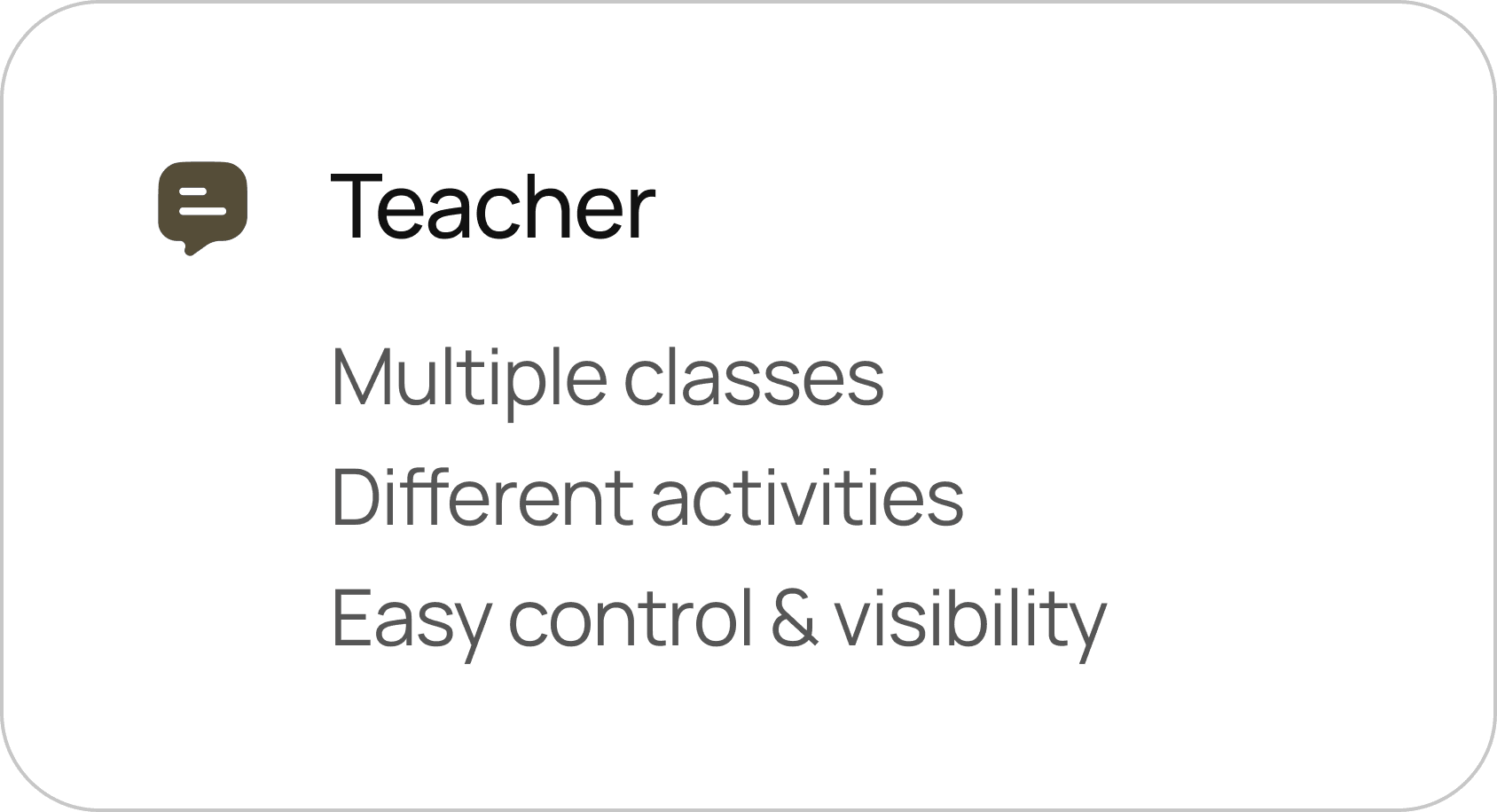
Our goal is to enable teachers to create multiple classes by
integrating their current My Page ID and school information.
Our goal is to enable teachers
to create multiple classes
by integrating their current
My Page ID and school information.
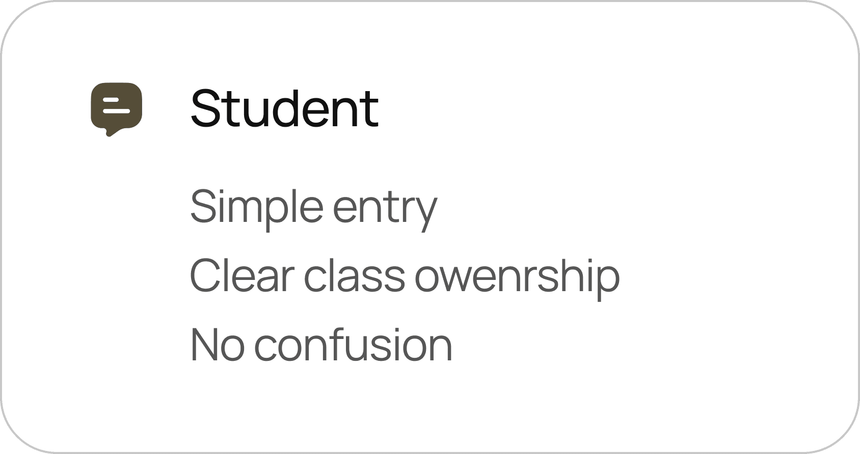
Additionally, we aim to implement an easy-access feature for students
that does not rely on the teacher's ID but uses a new approach.
Additionally, we aim to implement
an easy-access feature for students
that does not rely on the teacher's ID
but uses a new approach.
Based on the previous findings, we derived the core keyword "Create Class"
and examined the user journey for this feature from both perspectives.
Based on the previous findings,
we derived the core keyword
"Create Class" and examined
the user journey for this feature
from both perspectives.
Examining the overall framework from both users' perspectives
helped us understand and empathize with their viewpoints.
Examining the overall frame work
from both users' perspectives helped
us understand and empathize
with their viewpoints.
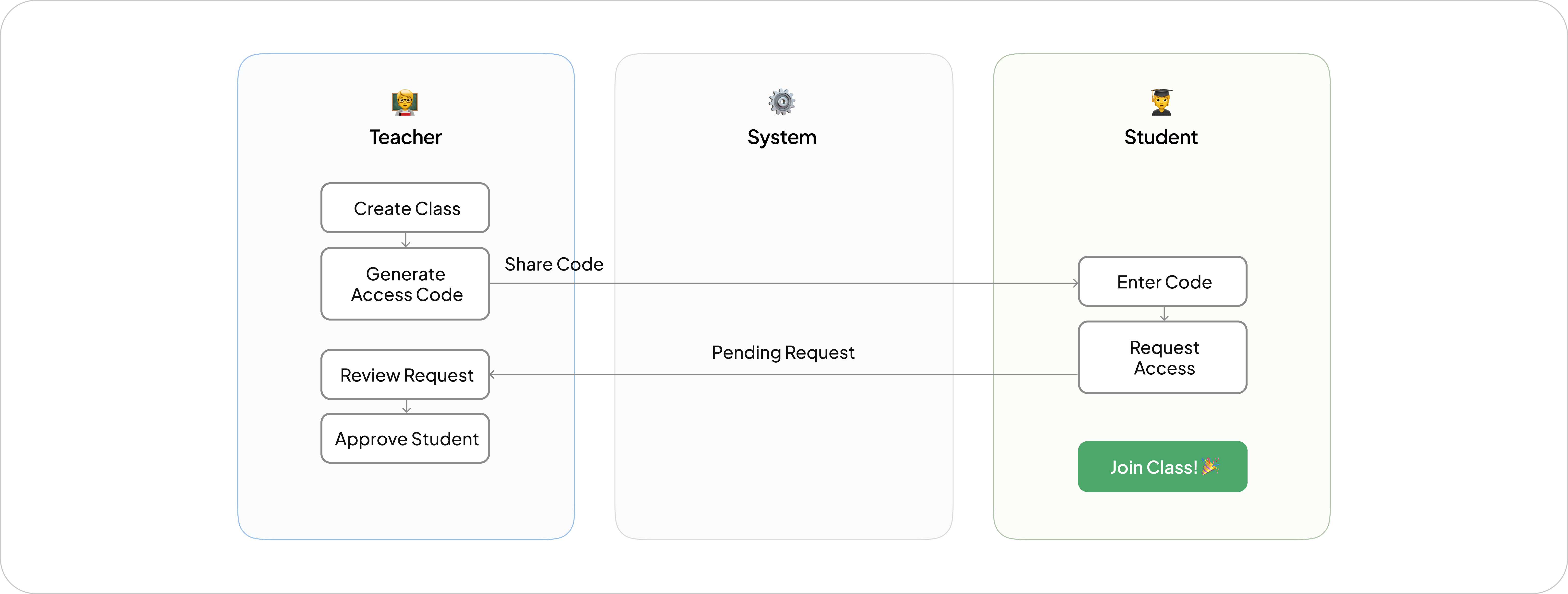
Originally, students were automatically enrolled in a class when they entered
a teacher’s ID during registration.
However, considering the need for
multiple class enrollments and
the challenges younger users, especially elementary students, face with English,
we decided to allow class registration using a class code of at least six digits.
After initially developing the two features mentioned above,we conducted
internal testing and further discussed adding a notification feature.
If a notification is sent to the teacher
when a student applies for a class,
the teacher wouldn’t need to check
the class page constantly.
However, when the service was first used, teachers and students usually registered together at school.
Therefore, it was suggested that simultaneous notifications might
actually cause inconvenience.
In addition to addressing the above issues,we also worked on various design updates throughout the project.
We first anticipated some unpredictable situations that could arise when student apply for a class. Based on this,
we decided that teacher should accept the applications for students to be enrolled in the class.
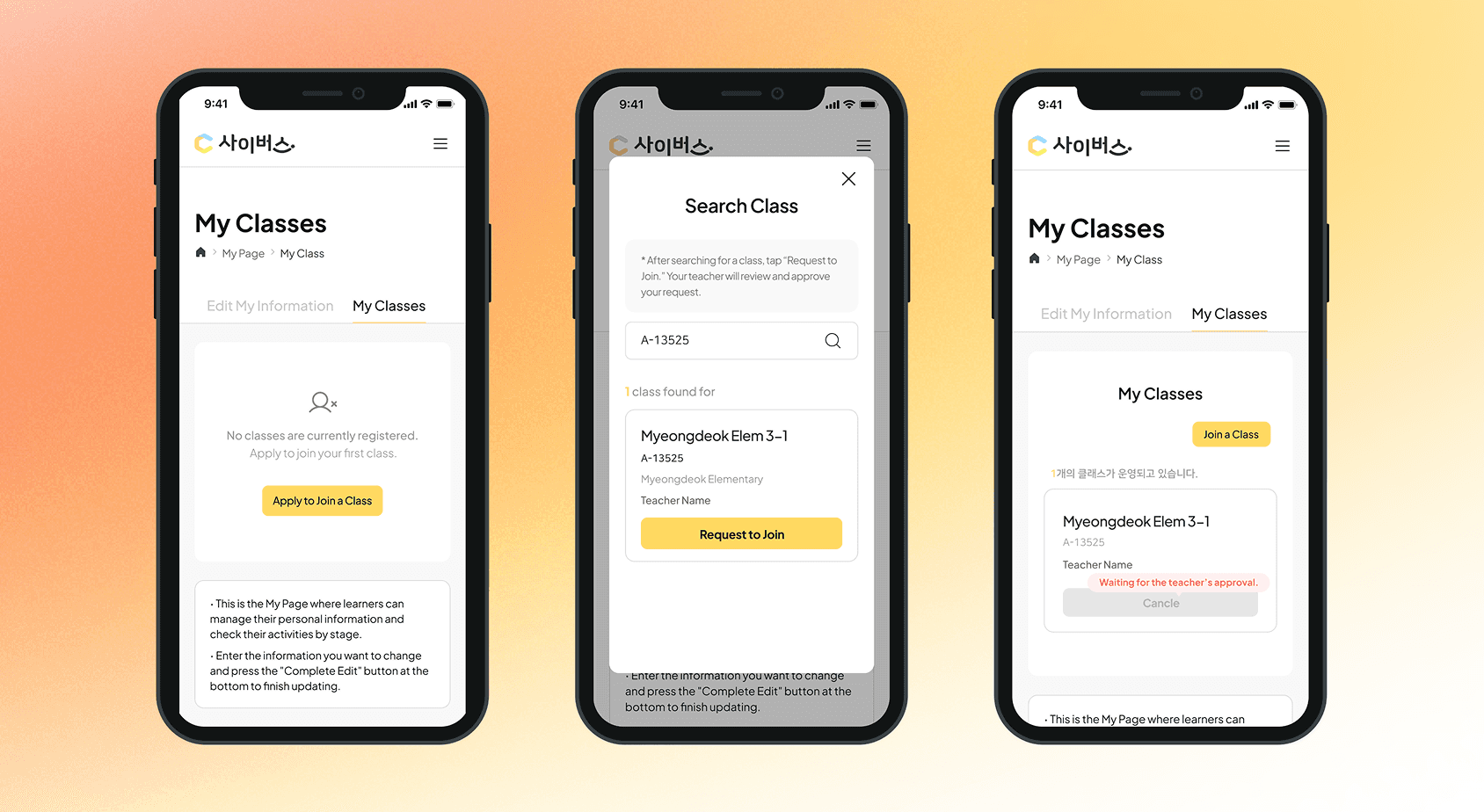
After submitting their application, students can see
a class card displayed as a box on the page.
We designed a box-shaped UI to distinguish between classes
with pending applications and those with accepted applications.
Chanllenge 1
After observing that the main page
created by the other company seemed simple and static, our product design
team decided to undertake a complete redesign to enhance its appeal.
We focused on designing
the main section and planned to include educational content about
cyberbullying, which was a priority
for the client. The layout was divided into three parts: a top section for transitioning to the metaverse, a central section
for educational content about cyberbullying, and a bottom section
for notices.
Chanllenge 2
Cyverse needs a user guide that
takes into account the age range
of its users.
The previous page focused on the top menu rather than the user guide context,
which is an important aspect. Therefore, we redesigned the flow from sign-up
to login to make it more noticeable, without emphasizing the top menu.
Additionally, overall consistency of
the elements was needed,
so we reworked the design, taking into account the color and size of the icons.
Originally, students were automatically enrolled in a class
when they entered a teacher’s ID during registration.
However, considering the need for multiple class enrollments and
the challenges younger users, especially elementary students, face with English,
we decided to allow class registration using a class code of at least six digits.
However, considering the need for multiple class enrollments
and the challenges younger users, especially elementary students,
face with English, we decided to allow class registration
using a class code of at least six digits.
We considered including various additional options, such as class name,
class introduction, and student number settings, when teachers create a class.
We considered including various additional options,
such as class name, class introduction, and student number settings,
when teachers create a class.
However, we deemed these features non-essential and focused on
the core functionality, allowing teachers to create a class
by simply entering the class name.
However, we deemed these features non-essential
and focused on the core functionality, allowing teachers
to create a class by simply entering the class name.
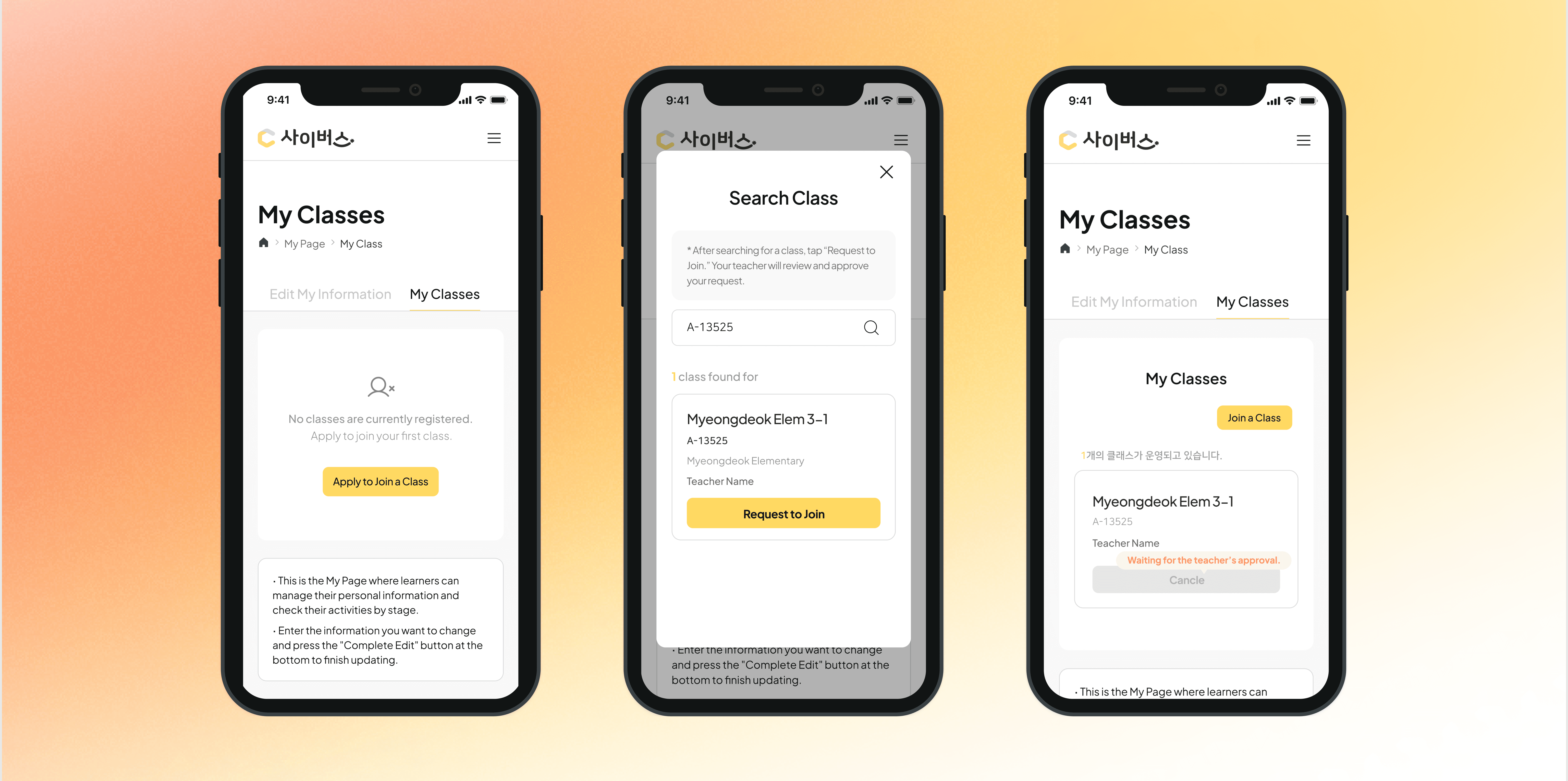
Originally, there wasn't a dedicated class page.
However, considering the need for multiple classes,
we decided to create a separate page.
As a result, users can now apply for a class within the "My Class" page.
Originally, there wasn't a dedicated
class page. However, considering
the need for multiple classes,
we decided to create a separate page.
As a result, users can now apply
for a class within the "My Class" page.
Originally, there wasn't a dedicated class page.
However, considering the need for multiple classes,
we decided to create a separate page. As a result, users can now
apply for a class within the "My Class" page.
Considering the user's perspective, we designed the main feature,
the "Class Registration" button, to be a clear focal point.
To make it immediately noticeable, we placed it
at the center of the page and used a primary color.
Considering the user's perspective,
we designed the main feature,
the "Class Registration" button, to be a clear focal point. To make it immediately noticeable, we placed it at the center of the page and used a primary color.
After submitting their application,
students can see a class card
displayed as a box on the page.
We designed a box-shaped UI to distinguish between classes
with pending applications and those
with accepted applications.
We first anticipated some unpredictable situations
that could arise when student apply for a class.
Based on this, we decided that teacher should accept
the applications for students to be enrolled in the class.
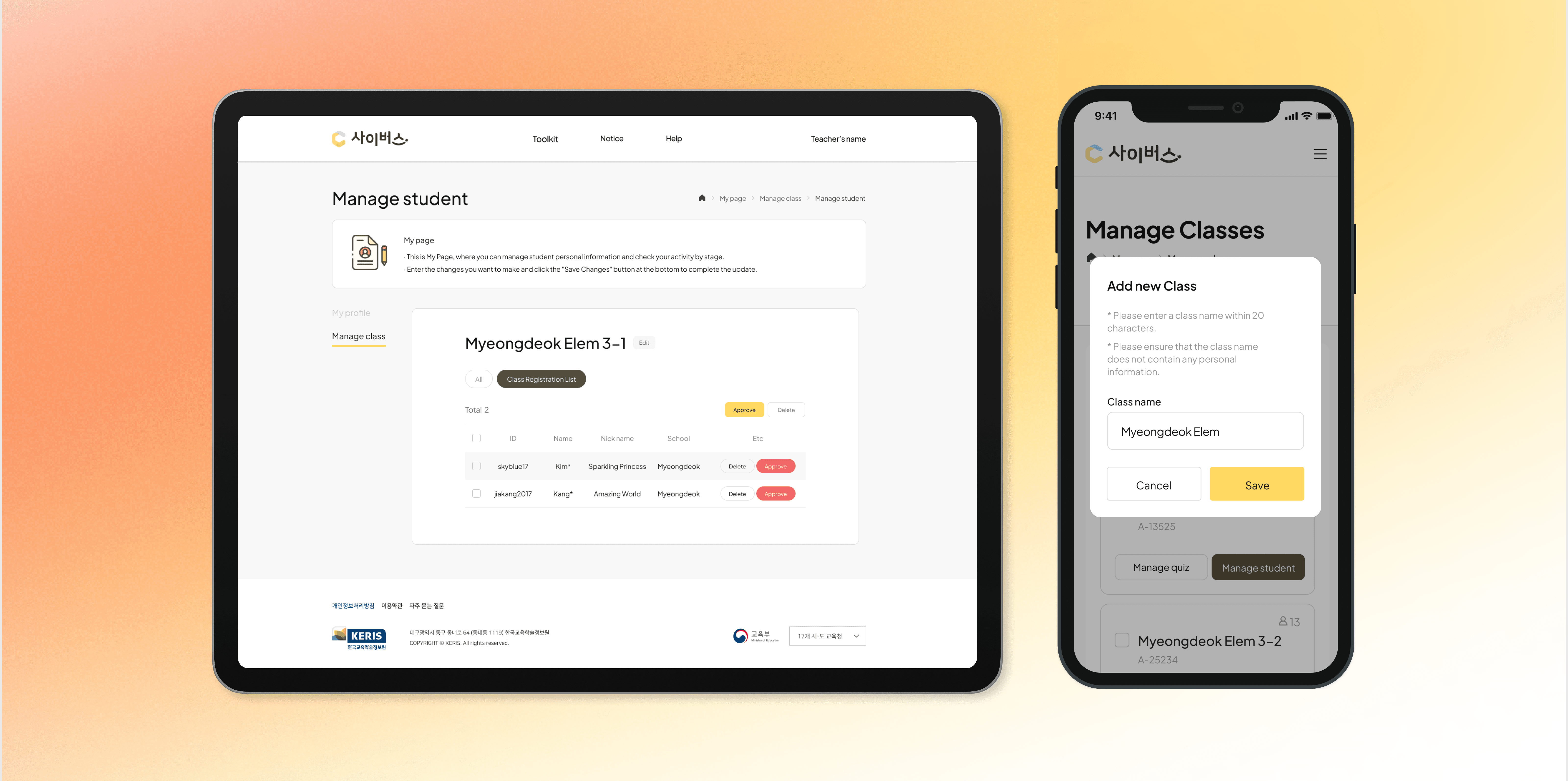
The main feature of the teacher's "Manage student" page
is managing students. By clicking the corresponding button,
you can view the complete list of students and class enrollment applicants.
The main feature of the teacher's "Student Management" page
is managing students. By clicking the corresponding button,
you can view the complete list of students and
class enrollment applicants.
To make it easier to identify the applicants, the menu tabs
at the top are designed to separate into 'All' and 'Class Enrollment Applicants.'
To make it easier to identify the applicants, the menu tabs
at the top are designed to separate into 'All' and
'Class Enrollment Applicants.'
We considered including various
additional options, such as class name,
class introduction, and student number settings, when teachers create a class.
However, we deemed these features
non-essential and focused on the core functionality, allowing teachers to create
a class by simply entering the class name.
The main feature of the teacher's
"Student Management" page is
managing students. By clicking
the corresponding button,
you can view the complete list of
students and class enrollment applicants.
To make it easier to identify
the applicants, the menu tabs
at the top are designed
to separate into "All" and
"Class Enrollment Applicants."
After submitting their application, students can see
a class card displayed as a box on the page.
We designed a box-shaped UI to distinguish between classes
with pending applications and those with accepted applications.
Chanllenge 1
According to the client’s opinion that the main
made by the other company looks simple and static,
the Product Design team decided to completely redesign it.
The former page was focused on the top menu,
not as a “context” of the user guide, which is important part of here.
Therefore, we redesigned the flow from sign-up to login to make it
more noticeable, without emphasizing the top part
that was focused on the menu.
The former page was focused on the top menu, not as a “context”
of the user guide, which is important part of here.
Therefore, we redesigned the flow from sign-up to login
to make it more noticeable, without emphasizing the top part
that was focused on the menu.
Chanllenge 2
Cyverse needs a user guide that considers the age range of its users.
Especially, I led the design of the main part and planned
to include educational content about cyberbullying,
which the client always emphasized. Therefore, the composition
was divided into three parts : a section at the top for transforming
to the metaverse, a central section for educational content
about cyberbullying, and a bottom section for notices.
Also, It seemed that overall consistency of the elements was needed,
so we reworked the design, considering the color and size of the icons.
After initially developing the two features mentioned above,
we conducted internal testing and further discussed adding a notification feature.
Creating a design system, ensuring consistency and accessibility across
the web and app
After initially developing the two features mentioned above,
we conducted internal testing and further discussed
adding a notification feature.
If a notification is sent to the teacher when a student applies for a class,
the teacher wouldn’t need to check the class page constantly.
However, when the service was first used, teachers and students
usually registered together at school. Therefore, it was suggested that
simultaneous notifications might actually cause inconvenience.
In addition to addressing the above issues,
we also worked on various design updates throughout the project.
In addition to addressing the above issues, we also worked on
various design updates throughout the project.
Chanllenge 1
After observing that the main page created by the other company
seemed simple and static, our product design team decided to undertake
a complete redesign to enhance its appeal.
We focused on designing the main section and planned to include
educational content about cyberbullying, which was a priority for the client.
The layout was divided into three parts: a top section for transitioning
to the metaverse, a central section for educational content
about cyberbullying, and a bottom section for notices.
Chanllenge 2
Cyverse needs a user guide that takes into account the age range of its users.
The previous page focused on the top menu rather than the user guide context,
which is an important aspect. Therefore, we redesigned the flow from sign-up to login
to make it more noticeable, without emphasizing the top menu.
Additionally, overall consistency of the elements was needed,
so we reworked the design, taking into account the color and size of the icons.
Creating a design system, ensuring consistency
and accessibility across the web and app.